 George S. Bebetsos, MSc1, Richard Turner2
1EHF Beach Handball Commission, member, 2EHF Strategic Business, Corporate Communication
Keywords:
Beach Handball, identity, customer, marketing, logotype
Introduction – Beach Handball
Beach Handball is a rapidly developing sport that combines sport with leisure. It is a new sport product and not a surrogate of (indoor) handball. Important aspects of Beach Handball are based on the new tendencies in today’s social life since Beach Handball allows space for creativity and development, is easy, fast, attractive and exciting and provides room for individual performance as well (van Linder, 2002). Ever since its first appearance, Beach Handball has become an integral part of the world of international handball (IHF, 2008). The development of Beach Handball as an independent kind of sport has made its progress over a period of less than ten years (Gehrer, 2008). Beach Handball has developed into a competitive sport and as such aims to enter the Summer Olympic Games, first as a demonstration sport (EHF, 2007).
EHF Beach Handball Commission
The European Handball Federation introduced Beach Handball as an activity in 1995 in order to:
-
cover the period between the indoor handball seasons during the summer
-
introduce the idea of handball to everybody
-
combine Beach Handball and leisure activities
-
influence the image of handball in a positive way (EHF, 1996)
The growing interest in this young sport can now be recognised all over Europe. Developments – especially as demonstrated by the European Championships – have shown that Beach Handball is an emerging branch of handball. Establishment of a Commission within the European Handball Federation would ensure the proper continuation of the work of the Beach Handball Task Force. Thus the Commission was established and formed on 26 September 2008 during the Federation’s 9th Ordinary Congress (EHF, 2008).
Corporate identity
Corporate identity is the pieces, aspects, ideas, methods and techniques, an organization or a company uses to differentiate itself from the rest (Jong, et al. 1990). When a brand is associated with a colour, a combination of colours, shapes, pictures, phrases, music, etc. a corporate identity plan has been carried out. It is proven that a company that has a consistent corporate identity is taken much more seriously than those that do not (Bernstein, 1984). A strong corporate identity reinforces brand recognition among the organization’s target audience. The development of a corporate identity project always starts with the design of a logotype: the most representative element of an organization. Its shapes, colours, fonts, look and feel will be transported to the other pieces that will constitute the organization’s identity. That is, the other design pieces that make up the organization’s corporate identity will be developed to match this logo (Heus, 2003).
Competition is tough for new beach sports
Competition throws a couple of big challenges at a new beach sport organisation:
First of all, the competition is big, almost unfathomably big. There are direct competitors – team beach sports (in the same geographical area or all over the world) who “sell” similar “products”- that fill a beach sport organization’s potential “clients” needs.
Then, there is the problem of trying to stay on top of how they are marketing, and what they are doing in their sports. What their logos look like. What their websites look like. How our sport organization’s designs stack up against our current competitors’. How they will look against the designs that the future competition – sports that have not even started up yet – will create? (Molerup, 1987)
Who are our clients/customers?
In order for a company or an organization to secure its position in the market the key is to secure the quality of its product/service/image (Schmidt and Ludlow, 2002). Beach Handball is a new sport product and not a surrogate of (indoor) handball. That means that there are producers and customers. In interactions, the customer/client is the most important element because it is he that defines the product’s quality by his tolerance, acceptance, appreciation or admiration.The sport clients/customers are divided in two major categories:
-
Internal clients
-
External clients
The internal customers for every sport are:
-
The athletes
-
The coaches
-
The technical officials (TOs- referees and delegates)
The external customers are:
-
The spectator
-
The mediaThe sponsors (van Linder, 2002)
Why the logo is essential as a marketing tool
Marketing experts urge businesses and organizations to “brand” their businesses and organizations with a logo and a set of consistent marketing tools (Olins, 1989). Some of the benefits of a professionally designed logo and identity system are:
-
Makes the organization look “bigger” and “established”.
-
Increases the organization’s chance of sponsors. The presentation of a wellrounded organization package that includes marketing materials and graphics makes the organization look more complete.
-
Attracts more clients and eventually sponsors. Some sponsors look for a welldefined organization, and “look and feel” may be one of their criteria for making a sponsoring decision.
-
Brands the organization. Quite often a logo is needed in order to build an image and a brand that is greater than the organization’s individual identity.
-
Conveys that the organization is reputable. A logo and professionally-printed materials show that the organization is committed to both its business and to its clients.
-
Gives clients and sponsors a sense of stability. The organization may not have been in business for a long time, but if it has invested in its identity, it is more likely to remain firm and relevant in the eyes of its customers. It goes a long way toward building that all-important “trust.”
-
Makes the organization more memorable. Forty percent of people better remember what they see than what they hear or read. So to have graphics associated with the organization, and to keep those graphics consistent, makes the organization more likely to be at the forefront of potential clients’ minds when they need the organization’s goods or services.
-
Explains the organization’s name. If the organization’s name contains a little-known word or an acronym, the logo can give visual clues to its meaning.
-
Endears the organization’s name to its clients. A difficult-to-pronounce or hard-toremember organization name makes it challenging for clients to approach. When potential clients need the organization’s services, they may not recall a tricky name. But if the name is reinforced with interesting, compelling graphics, they are more likely to remember the organization.
-
Explains an unusual line of organization. If the organization is non-traditional or in a hard-to-explain field; a logo can help to clarify exactly what it is that the organization does.
-
Differentiates the organization from the competition. A well-designed logo can have many subtle meanings and can begin to tell the story of how the organization does business, including the special practices that make the organization stand apart from the competition.
-
Assists the organization to stand out in its field. A well-designed logo and an identity system can put an organization far above the competition, especially when paired with a strong marketing program.
-
Helps the organization to comply with expectations. In some fields, a logo is just expected. In the sport sector especially, having a logo is a standard.Demonstrates the organization’s commitment. Done also for the sense of the organization’s pride, it will add to its practice. (Wheeler, 2006; Schultz, Hatch, Larsen, 2000)
Organizations eager to open their doors and expose themselves to the public often give little thought to their identity. With so much that needs to get done, somehow designing a memorable and effective logo hardly seems like a top priority. This oversight can prove to be a costly error. A quality logo design is one of the easiest ways to gain credibility and convey professionalism right from the start, when you need it most. Simply put, a logo can make or break an organization (Olins, 2003).
Good logos make great tools
Every day, the average person is exposed to millions of visual stimuli including hundreds of company logos. A logo is a unique visual image that represents an organization (or a company and its products). It aims to create a positive and memorable impression in the minds of the people who see it. Choosing a logo for an organization requires much thought and it is essential to work closely with a graphic designer (Olins, 1995). Designing a Logo needs the input of the organization as well as the designer’s creativity (Olins, 2008). In this case the newly formed EHF Beach Handball Working Group worked closely with the EHF Strategic Business and Corporate Communication Department.
The idea behind any logo is recognition. A great logo will always be remembered if it was created and designed properly. A great logo lasts and should look good years from now. It also stands out from its environment and from the competition. As well as building brandawareness and speaking for a sport organization, a great logo helps it expand and be established (provided of course that the organization has the sport product and service quality to back it up) (Rowden, 2004).
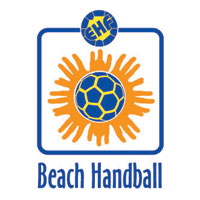
The EHF Beach Handball logo creative concept
In the process of creating the Beach Handball logo, the EHF Beach Handball Working Group and the Federation’s Strategic Business and Corporate Communication Department had to decide whether the logo should be an illustrative representation or abstract graphic that represents what the sport is, or whether it should be font-based (Napoles, 1998). It was finally decided that the logo would be a combination of these options. The new European Handball Federation Beach Handball logo brings together elements of sun, fun and an easygoing nature to a centrally strong administration. It is an identity mark that creates an inclusive brand for all EHF Beach Handball activities. It has at its centre, a handball, within a sun rays made up of hands. The EHF logo has been incorporated along with the blue and yellow colour scheme. A third colour, orange, has been added to offer a further connection to this, the sunniest of EHF handball logos.The typeface adds to the impression of a sport comfortable with its relaxed and friendly approach to competitive action. Consideration was taken in order for the logo to also look good in black and white for use in mono print applications or on faxes for example.
The new EHF Beach Handball logotype
![]()
Use and application of the EHF Beach Handball logo
The EHF Beach Handball logo will be used as the sport’s trademark in Europe:
-
to identify all the official forms of Beach Handball competition
-
on all the EHF Beach Handball related stationery
-
on the EHF flags, banners or printed material related to the sport
-
on the Technical Officials (TOs – referees and delegates) as well as on other Office and Beach Handball competition staff uniforms
-
eventually, on the national teams’ uniforms participating in the European Beach Handball Championships
-
for all the marketing and promotional activities
-
by the media
- by the sponsors